The key to designing a logo that resonates with your target audience is to keep it simple, unique, and visually appealing.
You must consider the color, typography, and graphic elements carefully to ensure they communicate the essence of your brand. Additionally, a well-designed logo can enhance brand recall and establish you as a professional and credible business. Therefore, investing in a logo that follows the propositional density principle can be a sound business strategy for building a strong brand identity and attracting more customers.
What is Propositional Density?
Propositional density is a measurement of the amount of information conveyed in a given statement or text. The higher the propositional density, the more information is packed into fewer words. This can result in more efficient communication and a more concise message, but it can also make the text more difficult to comprehend for those who are not familiar with the topic at hand.
Experts in a certain field may use high propositional density language to communicate more effectively with their peers, but they should be aware of the potential barriers to understanding that this may create for others outside of their field. Therefore, when crafting messages, it is important to balance the need for completeness and accuracy with the need to convey information in a clear and accessible manner for the intended audience.
Propositional density is a fascinating concept that has garnered a lot of attention in fields such as linguistics and communication studies, In Linguistics, this idea is called ‘polysemy’.
This measure is particularly important because it allows us to identify how much information or ideas are embedded in a given piece of text or speech.
Generally, the measure is calculated by counting the number of propositions or ideas expressed per unit of length. The resulting output gives us an idea of the complexity and coherence of the communication, which is an important aspect of effective communication.
What is more interesting is that propositions, which serve as the basic units of meaning in language, are statements or assertions that can be true or false. Therefore, by counting the number of propositions in a text or speech, we can get a sense of the richness and complexity of the information being conveyed.
How can it be used for during logo design process?
Propositional Density is an essential design concept that plays a vital role in the creation of a timeless logo. This design principle refers to the amount of meaning or propositions that are conveyed through a given design. When it comes to designing a logo that stands the test of time, propositional density can be a powerful tool. A logo that is rich in meaning and symbolism tends to resonate more deeply with consumers and convey a compelling message.
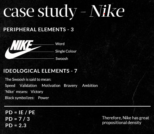
An excellent example of propositional density in logos is the Nike swoosh, which is a seemingly simple design but packed with meaning. The swoosh conveys an idea of speed and movement that aligns perfectly with the brand’s values. On the other hand, the Apple logo symbolizes innovation and creativity.
To create a captivating and timeless logo using propositional density, the brand needs to distill its values, mission, and target audience into a single, powerful image or symbol. By doing so, the logo will allow the consumers to connect with the brand on a deeper level, creating a strong emotional bond that fosters loyalty and success. So, if you are looking to create a timeless logo, consider adopting propositional density in your design process.
- Begin by identifying the core message of your brand.
This message will inform the design of your logo and help you determine the elements that should appear in the logo. - Determine the Propositional Density (PD) of each element you want to include in your logo.
To understand this principle, you need to know that there are two parts to a logo:
The Peripheral: The lines, shapes, space, color, and text that make up the logo. These are the parts of the logo you can see.
The Ideological: These are the meanings embedded into the Logo.
A high Propositional Density means embedding more ideas with fewer words. .
To achieve this, you should limit the words that do not carry much meaning, such as articles, prepositions, and conjunctions, these are called Peripheral Elements.
On the other hand, you should include more words that express your main points, such as nouns, verbs, & adjectives, these are called Ideological Elements.
To measure propositional density, you need to divide the number of ideological elements by the number of peripheral elements, the formula is therefore:
PD = IE/P
- Aim for PD to be greater than 1.
This ensures that each element carries a significant amount of information and contributes meaningfully to the overall design.
If your answer is greater than 1, then the logo enjoys good propositional density. - Use negative space to balance the PD of your logo elements.
Negative space is the unused space around or between the graphic elements. A properly balanced PD distribution creates an aesthetically pleasing design that is easy to read and remember. - Test your logo across different media and applications to ensure its readability and longevity.
A timeless logo should be easy to reproduce across various mediums and should maintain its visual impact over time.
How can we help?
Get ready to level up your brand with our Logo design service!
Our Expert Logo designers will work with you to create a unique, professional logo that perfectly represents your business. A powerful logo is a crucial element of any successful brand, and we are here to help you stand out in today’s crowded marketplace.
Contact us today to get started and see the difference a great logo can make!
References:
– Gobé, M. (2009). Emotional branding: The new paradigm for connecting brands to people. Allworth Press.
– Tufte, E. R. (1997). Visually displaying quantitative information. Graphics Press.
-mayorofbranding- https://www.instagram.com/mayorofbranding/


