In the competitive world of branding, a logo isn’t just a symbol—it’s the face of your brand. Ever wondered why some logos leave a lasting impression while others fade away into oblivion? This blog will explore various logo elements, their positive and negative impacts, and how they can be effectively utilized to unlock your brand’s potential. We’ll delve into the significance of symbols, typography, colors, shapes, and imagery, providing a comprehensive understanding of how each element contributes to your brand’s identity.
The Importance of Logo Elements.
Understanding these elements is crucial for any brand aiming to create a strong, memorable logo that resonates with its audience. Whether you’re a business owner, a marketing professional, or a designer, mastering these components can set your brand apart in a crowded market.
Defining Key Concepts
What Are Logo Elements?
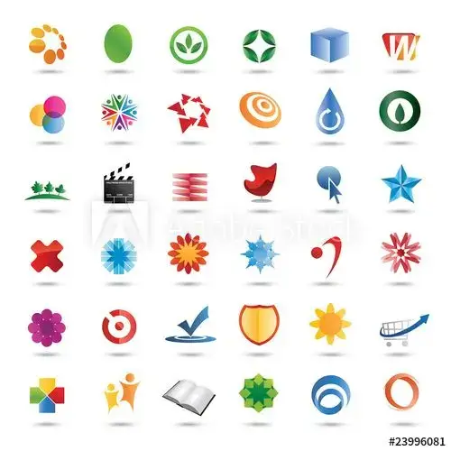
Logo elements are the individual components that form a logo design. These include symbols, typography, colors, shapes, and imagery, each playing a vital role in creating a visual representation of a brand. The choice and combination of these elements can greatly impact how a brand is perceived and remembered by its audience.
Examples: Think of Apple’s iconic apple, Nike’s swoosh, and McDonald’s golden arches. Each of these logos uses specific elements to convey their brand’s message and values.
Influential Logo Elements and Their Impacts on Brands
Symbols and Icons.
Symbols can quickly communicate a brand’s core message, making it easy for consumers to recognize and remember the brand.
Positive Impact: Symbols improve brand recall and instant recognition.
Negative Impact: Overuse of common symbols can lead to a lack of uniqueness and brand differentiation.
Study Reference: According to a study by the Journal of Marketing Research, symbols that directly relate to a brand’s service improve brand recall by 40%.
Typography
The choice of font style can convey different brand characteristics, such as tradition, modernity, elegance, or friendliness.
Positive Impact: Typography can enhance readability and convey the brand’s personality.
Negative Impact: Poor font choices can make the logo hard to read or fail to convey the desired brand message.
Study Reference: A research paper from the American Marketing Association, highlights that typography significantly influences consumer perception and trust in a brand.
Color Palette
Colors evoke emotions and can create strong associations. For instance, blue often represents trust and professionalism, while red conveys energy and passion.
Positive Impact: Colors can increase brand recognition and convey specific emotions.
Negative Impact: Misinterpretation of colors across different cultures can lead to unintended brand perceptions.
Study Reference: Research by the University of Loyola shows that color increases brand recognition by up to 80%. An example of this can be seen in the lawsuit against Gap in 2010 when they attempted to redesign their logo, causing a public backlash due to the abrupt and culturally insensitive changes.
Shapes and Lines
Geometric shapes and lines add balance and harmony to a logo. Circles symbolize unity and harmony, while squares denote stability and reliability.
Positive Impact: Shapes contribute to positive brand perceptions and add balance.
Negative Impact: Overly generic shapes can make the logo less distinctive and memorable.
Study Reference: A study published in the Journal of Consumer Psychology indicates that shapes and symmetry in logos contribute to positive brand perceptions.
Imagery
Pictures or illustrations can make a logo more descriptive and engaging, clearly representing the brand’s offerings.
Positive Impact: Clear imagery can make the logo more engaging and trustworthy.
Negative Impact: Detailed imagery can become outdated quickly and may not scale well across different media.
Study Reference: Findings from the Journal of Advertising suggest that logos with clear imagery are perceived as more trustworthy and reliable.
Overused Logo Elements and their effects on Brands
Arrows
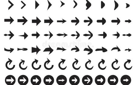
Arrows are often used to symbolize direction, movement, or progress. However, when overused, they can become clichéd and lose their effectiveness.
Effect on Brand Differentiation: Using arrows frequently can make logos look generic and unoriginal, leading to weak brand recall and poor differentiation from competitors.
Solution: Use arrows sparingly and creatively. Combine them with other unique elements to create differentiation and originality.
Gears
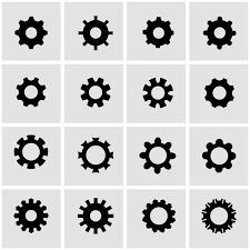
Gears are commonly used to represent machinery, industry, and mechanics. Overuse of gears can make logos look uninspired and less distinctive.
Effect on Brand Perception: Gears can become clichéd and lose their unique appeal if overused, making it hard for brands to stand out.
Solution: Integrate gears with other less common elements or stylize them uniquely to keep the technical symbolism while adding a distinctive touch.
Abstract Road Shapes
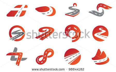
Abstract road shapes are used to symbolize progress, journeys, and pathways. When overused, they can lose their ability to stand out.
Effect on Brand Visibility: These shapes symbolize progress and movement but can become ineffective due to overuse, making it difficult for brands to stand out in a crowded market.
Solution: Combine abstract road shapes with other unique elements or use them in novel contexts to maintain symbolism while enhancing originality.
Speech Bubbles
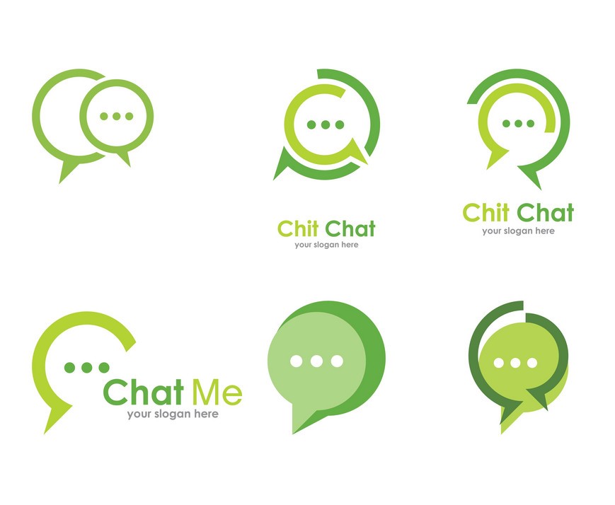
Speech bubbles represent communication and dialogue. Their widespread use can make logos look less distinctive.
Effect on Brand Originality: Speech bubbles can effectively convey the idea of conversation and interaction. However, their widespread use has made them a cliché, reducing their ability to create a distinct brand identity.
Solution: Innovate by using alternative symbols for communication, such as modern chat icons or stylized dialogue elements.
Abstract Car Shapes
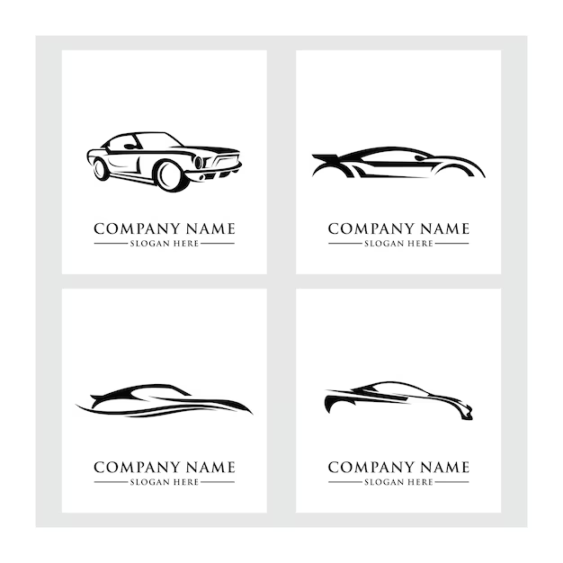
Abstract car shapes symbolize speed, travel, and transportation. Overuse can make these logos blend in with others.
Effect on Brand Uniqueness: Abstract car shapes symbolize speed and travel but can lack uniqueness if overused, making it hard for brands to differentiate themselves.
Solution: Use more specific or stylized representations of transportation, or incorporate them into broader, unique designs to enhance differentiation.
Leaves and Trees
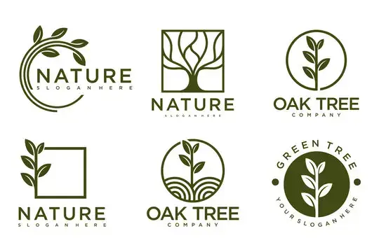
Leaves and trees are used to symbolize nature, growth, and sustainability. Their frequent use can make logos appear generic.
Effect on Brand Recognition: Leaves and trees symbolize nature and sustainability but have become generic due to frequent use, making it harder for brands to stand out in a competitive market.
Solution: Combine leaves and trees with other elements or use abstract representations to maintain the environmental theme while creating a unique identity.
Company Acronyms in 3D Cubes
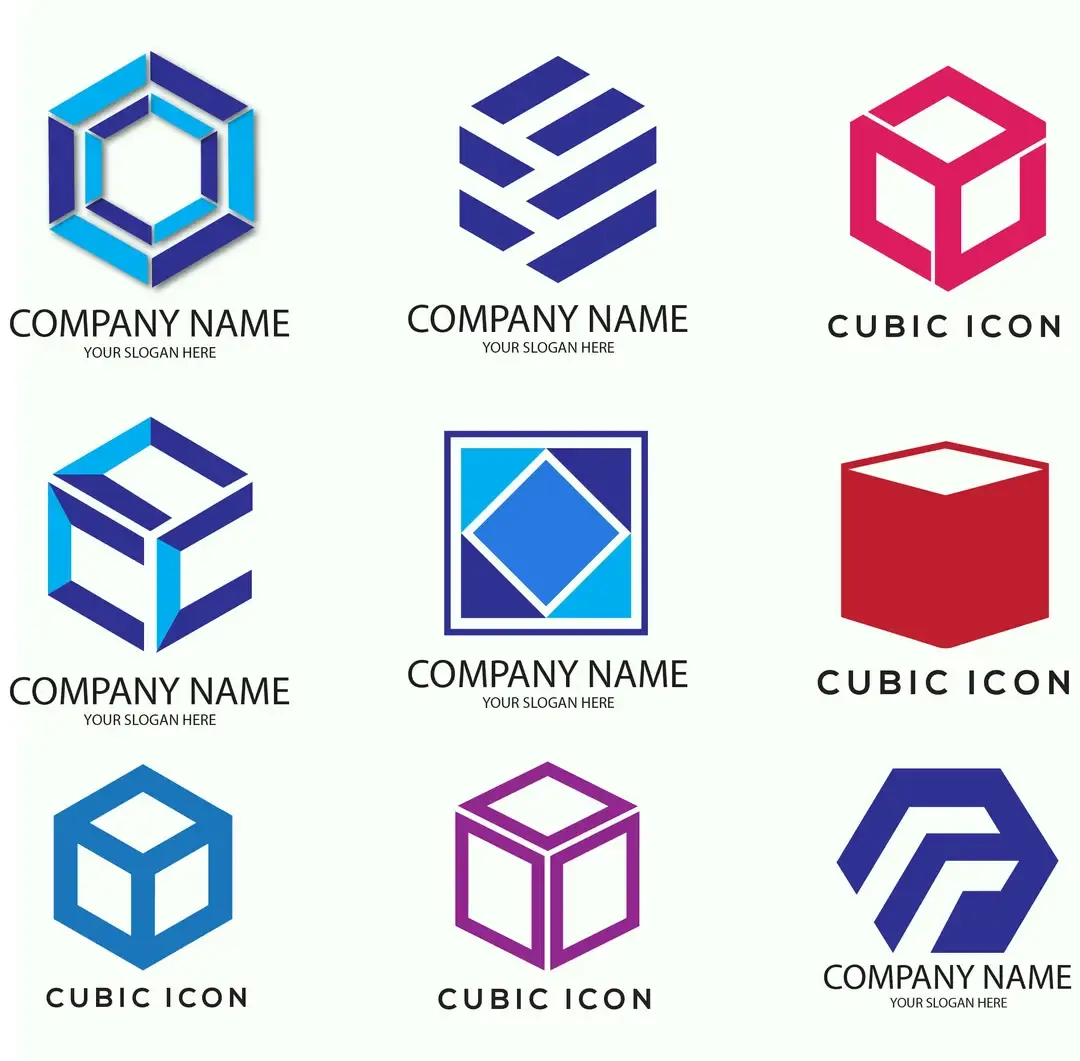
3D cubes are often used to give a modern, tech-savvy feel. Overuse can make logos appear unoriginal.
Effect on Brand Modernity: While 3D cubes can add a modern and tech-savvy feel, their overuse has made them clichéd, causing logos with these elements to appear unoriginal.
Solution: Use other geometric shapes or innovative 3D effects to maintain a modern look while adding originality.
Company Names in Circles
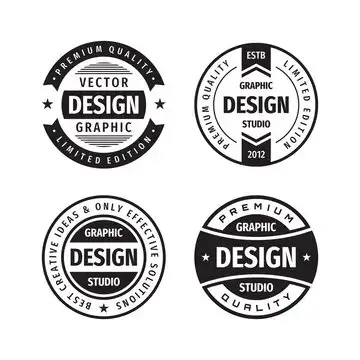
Company names in circles are used to create a sense of unity and completeness. However, this design is very common.
Effect on Brand Unity: Circles convey unity and completeness but are widespread, diminishing their impact and making it harder for brands to stand out.
Solution: Experiment with different shapes or use circles innovatively, such as combining them with other elements to create a unique design.
Swooshes
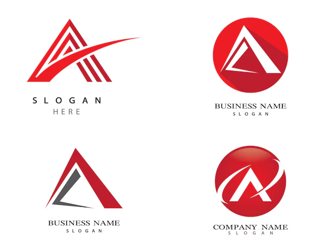
Swooshes are curved lines that convey speed, agility, and dynamism. Their overuse has made them a common design element, reducing their impact.
Effect on Brand Identity: Swooshes are meant to convey motion and agility but have become too common, reducing their effectiveness in creating a unique brand identity.
Solution: Avoid using swooshes unless necessary. Instead, explore alternative ways to represent motion, such as through dynamic shapes or innovative typography.
Abstract People Shapes
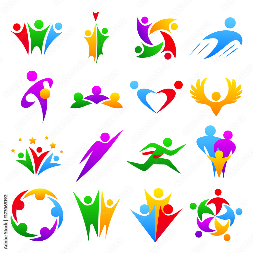
Abstract people shapes are used to symbolize community, teamwork, and human-centric services. They can lose their distinctiveness when overused.
Effect on Brand Connection: Abstract people shapes symbolize community and teamwork but can lose their distinctiveness if overused, reducing their effectiveness in creating a unique brand identity.
Solution: Use more specific or stylized representations of people or combine them with other unique elements to enhance distinctiveness.
Recommendations
Creating a distinctive and memorable logo is crucial for standing out in today’s competitive market. By avoiding overused design elements and focusing on originality and creativity, brands can develop logos that effectively communicate their identity and resonate with their audience.
Unlock your brand’s potential with a unique and impactful logo! Whether you’re a startup or an established brand looking to refresh your identity, following these best practices can help you create a logo that truly represents your values and stands out from the crowd. For more insights and personalized assistance, contact our professional brand designers at foxtelBrands. We’re here to help you every step of the way!
Conclusion
Creating a distinctive and memorable logo is crucial for standing out in today’s competitive market. By avoiding overused design elements and focusing on originality and creativity, brands can develop logos that effectively communicate their identity and resonate with their audience.
Unlock your brand’s potential with a unique and impactful logo! Whether you’re a startup or an established brand looking to refresh your identity, following these best practices can help you create a logo that truly represents your values and stands out from the crowd. For more insights and personalized assistance, contact our professional brand designers at foxtelBrands. We’re here to help you every step of the way!

